Archive for July, 2011

Glassy Buttons on a Magnifier

Glassy buttons, or other controls, have a great appeal because of their transparent and shiny character. They remind us of gems. In user interfaces, the transparent character is also of great use in case you need to see what is beneath the control.

Recently, I dug up the Silverlight Glass Button tutorial by Martin Grayson. This glass button consists not only of a very fine looking exterior, but also has sophisticated animated behavior. An overview of the steps to create such a button is as follows below.

Creating the Glassy Button

  1. Create project in Blend
  2. Set the root background to a gradient color that blends well with the color of the glass button.
  3. Create a button and start editing the template (empty template option)
  4. Add a Border control to the template: the button’s Outer Border
    1. Add a second border, within the outer border: the Inner Border. Set the backgroundColor to Black, and the Alpha to 0.5.
    2. Add Grid to Inner Border with a row divider to middle of the grid
    3. Add border to top row: the Shine. Remove the margins, set the V / H alignment to stretch, and set the background to linear gradient from top to bottom. Set the Black gradient stop to Alpha = 60%, color=white. Set Other gradient stop to Alpha = 20%.
  5. Add ContentPresenter to the center of the Button. Set it between Shine and Glow (see below). Set Foreground color to white (or other color that stands out).

This is the standard look of the button. Now add a blue Vista glow for the MouseOver event.

  1. Add another border, called Glow to the Grid, RowSpan = 2. Width=Auto, H/V align = stretch. The Background is a RadialGradientBrush. Set the left gradient stop to a light blue (141, 189, 255) with alpha: 70%, and the right stop to the same color with alpha = 0. Expand the gradient beyond the bounds of the button to look like the rising sun in the top row. Set the glow behind the Shine. Set opacity of the control to 0, animation that will show it will be added later
  2. Animate the MouseOver state transition by moving the Glow opacity in 0.33 s to 1.0, including revert.
  3. Animate the button Press state transition by hiding the Glow (Visibility:Hidden), setting the Opacity of the Shine to 40%, and settting the Background Border opacity from 80% to 50%.

That’s it. Of Course, the color of the button is arbitrary, as is the color of the Shine and Glow. This idea could be extended by providing an extra bottom layer onto which you could project items. Possible items are an image, a video, a Dropshadow of the text in the button’s Content control, etc. Another extension might be to apply the inner shadow by Samual Jack.

The Magnifier control

The glassy button has been used in a magnifier control. A magnifier can be used to enlarge pieces of the client window in order to study it with more precision. This specific magnifier has five buttons: enlarge what is under the magnifying glass, reduce it, reset it to normal, and then: flip the image horizontally or vertically (toggles). This last functionality may come in handy if you want to study rotated / mirrored images.

Note that this is the second time that we encounter the need for a jog / shuttle control: to be able to rotate the magnified image to arbitrary angle, apart from mirroring, would be an improvement. In this specific application we would use the jog / shuttle control as a rim around the magnifying glass.

Okay, back to the Glassy Buttons. They fit nicely in this design since you can look through them when positioning the magnifier. The outer border of the magnifying glass has been transparently colored using a rainbow like gradient so you can find it back, also in a multicolored image like the one in the example App.

In order to position the magnifier, you can drag it around by the rim. The functionality was added using the Expression Blend MouseDragElementBehavior. Although this behavior doesn’t work for Buttons, it works for controls that contain Buttons.

The magnifier uses two WriteableBitmaps. One to hold an image of the LayoutRoot, and one to hold the image of the magnifier. Copying is done using the Clear and the Blit function in the WriteableBitmap Extensions. Of course, before copying the visible rectangle has to be determined, for situations in which the magnifier is only partly visible (off screen / covered).

A specific problem solved was how to initially get the bitmap of the LayoutRoot. If the image is loaded from the hosting web site, and is not present in the xap itself, the LayoutRoot bitmap remains empty, until created after the first rendering. For all clarity, the creation of the LayoutRoot bitmap is located in the SizeChanged event handler. So, we have the initial LayoutRoot bitmap created the first time the magnifier bitmap is created – code guarded by a Boolean flag :-(.

The magnification itself, as well as the horizontal and vertical flips is done by means of a simple pixel shader.

Advertisement

Glossy Button

The MS Expression Blend tutorials contain a tutorial on creating a glossy button. Well, I like shiny things, so I got into it. The tutorial is very practically oriented, so in this blog post we’ll start with some remarks on lighting practices that might create the illusion of a shiny object on your screen.

Lighting

With respect to lighting concepts, I will somewhat follow Frank D. Luna here. Factors at play in lighting are directional and wavelength attributes of the light(s) involved and reflective properties of the material the light.

Light

For people, colored light is a compound of Red, Green and Blue light in varying intensities. The relative intensities of these components define the colors we know.

Ambient lighting is lighting of an object by indirect light, light that has been reflected multiple times, and thus has no specific source. In Ambient lighting models, neither the position of the observer nor the position of the light source plays a role. You might think of ambient light as showing the color of an object (dependent on the color of the light, of course).

Diffuse lighting of an object describes the scattering reflections of light coming from a specific source. The smoother the surface, the less diffuse its reflection, the shinier it looks. In Diffuse lighting models, the position of the light source, but not the position of the observer is defined. We could say that diffuse lighting creates a gloss on smooth surfaces.

Specular lighting of an object involves directed light that reflects (mostly) in a specific direction – ‘a cone of reflection’. In Specular lighting both the position of the light source and the observer is relevant – the observer might not see the specular reflection. We might say that specular lighting creates the shine on a smooth surface.

Light sources come in three flavors: parallel light sources, like the sun; point light sources, like a light bulb, and spotlights, like a flashlight.  In 3D models, parallel light has a direction but no source location; light from a point source has a source position and an
intensity that decreases quadratically with distance from the source. It lights objects in all directions. Spotlights have a source position, a specific direction and also attenuation. According to Lambert’s Cosine Law, reflected light intensity depends as the cosine function on the angle at which the light hits a surface, so perceived reflected light intensity depends on both the angle and the distance.

Material

Material properties define which wavelengths will be absorbed and which will be reflected (and to what extent). This defines the color and smoothness properties. Rough material will reflect light diffusely in all directions. If subjected to a strong light source, it will glow brightly, but will have hardly any gloss, and no shine. Conversely a smooth object will have a clear gloss and almost act as a mirror for the specular light (for an observer in an adequate position).

Modeling lighting of a glossy button

In a DirectX or XNA application you can model lighting extensively, and the result will be quite realistic. This realism comes at the price of significant resources, which cannot be spent on ‘just’ a button, so the same effects will have to be simulated by other means. In this section we will first analyze the construction of the glossy button from the tutorial, and then add some more features – for fun and enlightenment.

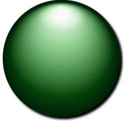
The Glossy Button Tutorial starts out with an ellipse, the button, that has a gradient color (and a robust edge). The gradient thus covers both ambient and diffuse lighting. A second layer, the gloss, consists of an ellipse that has a white gradient color, running into transparency. It also has a mild blur effect. This ellipse covers about two thirds of the button. The final layer, the shine, is a third ellipse, a much smaller one that also has a gradient white color, moving into transparency. The result is pretty cool, isn’t it?

Had I already mentioned the drop shadow (bottom right)?

Well, although pretty cool, one may have some disturbing questions, like: ‘What exactly is the shape of this button?’, or, ‘Where does the light come from?’ The shape cannot be a sphere, for that the gloss extends too far to the bottom, or alternatively, the shine is too close to the top. Also, it is weird that the drop shadow is bottom right, while the shine is in the middle. I also do not think that this button is very shiny, it doesn’t look it has a top layer of glass, like really shiny things do (I will get into this really shiny stuff in another blog post). Finally, it is strange that the rim has the same color all around the button. So, the conclusion is that the ingredients may be there, but the recipe isn’t quite right.

I have tried to improve a bit on these shortcomings but in the eyes of the reader it might just as well have become worse, so read on ;- ).

The glossy button demo application

The demo application has a number of additional features, the simplest being a text on the button. Also, the size of the button is rather large here, but it can be set differently using Width and Height dependency properties without adversely affecting the visual properties or behavior of the control.

Color picker

The user can pick a color for the button using the color picker. The color you select is the bright color in the gradient. The application adds the dark end of the gradient itself. The rim is also set to the dark color derived from the selected color. The color picker control is part of the CodePlex Silverlight Contrib project.

Follow the mouse pointer

Although I’m not a fan of things on your desktop that follow your mouse pointer, I did provide the option here. It was either follow the mouse pointer or develop a kind of jog/shuttle control to move the three gradients over the surface of the button, and this is quicker. So what you see is that within a certain range around the button, the button gradient, the gloss and the shine all follow the mouse pointer. The button does seem to a spherical shape when you move around.

Proximity color effect

A more experimental addition is that when the mouse pointer comes close to the button, light intensity increases. This means also that for some lighter colors, the color changes if the mouse pointer is over the button. This would agree with the common experience that harsh white light dims or removes color.

Mouse Pressed visual state

When the left mouse button is pressed, a simple animation increases the size of the gloss and shine.

Concluding remarks

After some pondering about some nagging dissatisfaction with the results I realized that a really shiny button also reflects the objects nearby. Reflection is what really makes the difference. So, if you really want to have shiny buttons, you are in for true 3D models in you user experience. Although that seems a far cry, the general use of 3D modeled user interfaces seems to gain momentum now. Just note tendencies like the use of the Kinect, the integration of Silverlight and XNA, the use of 3D in CSS3 and Html5, and, of course 3D video – without glasses even.

On the other hand, shiny buttons that do not reflect are already part of the Apple UX. In that case you see that the buttons are more like colored glass. These subjects, glassy buttons, and 3D user interfaces, will be subjects of upcoming blog posts.